Monday, 21 November 2011

Further research..

In order to produce my contextual review, I had to present a PowerPoint demonstrating the development in research that I have gained so far. After receiving feedback about this this work, I plan on gathering more information on the three most important aspects of my research.
These are;
  1. How religious matters can be carefully expressed through an artwork without it being controversial or causing any controversy,
  2. How text can advance our way into thinking deeply about the concepts and meaning behind the artwork,
  3. How the context can be identified in an artwork whether it has been taken out or not.

Tuesday, 1 November 2011

Holding On, Letting Go & Second Life Project


In this project, I started my ideas with gallery visits, research through various texts and a mind map. After the final pieces were done for both projects, which were ‘Holding On, Letting Go’ and ‘Second Life’, I participated in a seminar for each of them. These helped me follow on and develop my ideas, which involved discussions with fellow colleagues about their work and received feedback from them on my work. There were also tutors involved who helped express their opinions along with others, recommend artists and help within development for my ideas. It helped a lot as my final pieces included text with photographs, which is the first time that I have ever used this method. In my opinion, it worked well and I plan on researching into it and working with this method more.

The feedback that I gained had a lot of comments and views on the sentences and text. In ‘Holding On, Letting Go’, I was told that the gaps between the words make the sentence ‘Wish You Were Here’ look longing and poetic. The image along side the text gave a sense of campaign. In ‘Second Life’ I had much better feedback. I will obviously use this feedback to carry on the process of ideas within my research and work. The text gave the idea of lost loved one’s, sense of loss and emptiness, and afterlife. The photographs that I chose to use along side the text definitely played a big part on the sentences. They helped send the messages across to my colleagues, tutors and other viewers. They also served a purpose by identifying how I feel while thinking the phrases. For example, wish you were closer not distant, anticipation and patience for time, the loved one’s are still there but you can’t see them, and hazy memories.


I plan on taking these ideas further with a choice of methods. The methods or medium that I may use in my next work could possibly involve using mechanical cameras, light boxes, dark room development, video installation, photograms or change of colour themes in the photographs, but staying on the subject of text. I will be researching more into these ideas with the help of contextual and artist references and gallery visits to help me move onto the next stage. I will develop onto my next works possibly with the help from the public to find out how they deal with the emotions of losing loved one’s and transfer my works into their context. In my recent final pieces, the messages were quite personal which people did just about understand but they did not understand the deeper meaning as those quotes run through my thoughts at some point in every single day.

Sunday, 30 October 2011

The Practitioner's Library

1. An article from a magazine/periodical..

ArtForum - 'Turner Again' written by Adrian Searle, on findarticles.com
Copyright 1995 Artforum International Magazine, Inc.


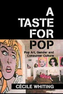
2. A quote from a book..

Book - 'A Taste For Pop: Pop Art, Gender and Consumer Culture' by Cecile Whiting.
 

Quote - "The Supermarket shopper can examine a brand, place it on her shopping basket, return it to the shelf, examine another brand, and choose or reject to her heart's content. She feels that she is buying wisely." by Harry Hepner, page 33.

3. A page from an e-resource..


Art Monthly - 'Supermarket' by David Barrett, 1997 (Article).


As part of this research activity I decided to research into the reason why Sarah Staton made her 'Supastore' they way she did, compared to other artists shop-like installations.
The quote that I located refers to Andy Warhol's 'Campbell Soup' at the Bianchini Gallery, New York in 1964. It was disguised as a small-scale supermarket, which was also a combination of few artists; Andy Warhol, Robert Watts and Billy Apple. This installation piece appealed more to both the price-conscious homemakers and the Pop-art experts. The quote clearly describes the shopper as a stereotypical woman and how we function when we are in a shop with all of the typical surroundings of shelves and products.
After reading the two articles, I learnt a relative amount of how she put this idea into place.
The shop is based on a collision between crudeness and sophistication. It concentrates on work by younger British artist, the reason being because they have no money and don't have a proper or very sufficient market for their work. In order to be part of this exhibition/shop, they made conventional pieces of work that they could produce in multiples, that reflected on both their circumstances and their aspirations.They would need to be pieces that are portable and for sale. I have now realised that multiples are a very clever, not always easy to produce, but a simple way or urge to make money through art. By using this method, the artist and gallery make desperately needed cash, and the buyer gets relatively cheap art work. Multiples could be seen as tokens that you receive from business', but they are obviously more than that, which then questions whether multiples can be classed as a proper art work. They take away the uniqueness and removes important factors of the art piece, which demand more care and attention than other artworks, just leaving an idea. As we all know every highly-skilled professional artists want to earn from their talents in the same way as any other professional.

Saturday, 15 October 2011

What could be the context of my contextual review?


  • The religious context plays a big part in the contextual review. A piece of work that this relates to is Nathan Coley's 'Heaven Is a Place Where Nothing Ever Happens'. In this case, site-specific installation is involved where the artist intends on drawing our attention to a particular place or time. He uses controversial and blunt statements about the supernatural with the aspect of religious architecture, where he tends to state the obvious. By doing this he raises interesting questions and awareness about the nature of the world that we live around or in and the place for religious belief in the world. It seems that in these circumstances you would need to be careful of what message you are sending across through religious statements. To some viewers it can often seem offensive as they may believe strongly against the statement, or the case of confusion, where viewers has no idea of why it has been mentioned.
  • Text is the most obvious aspect in any art that has a statement made within writing. When looking at art today, with the world that we live in now, most un-harming statements are taking out of context. It's either the way and how we think towards them or the way they are shown and how the messages look to be sent across to the viewer. Kieth Arnatt's 'Notes From My Wife' is a definite example for this. Even though they were the most poignant jottings and notes that he could find written by his wife, and not statements, he would intentionally take them out of the original context and blow them up, to then make them look surreal.
  • The colours can also be used to somehow send a message across, whether it's bold, bland, colourful or just simple. Keith Harings 'Pop Shop' is an example of this. He used bold and bright colours for his images which could refer to being graffiti like. As he covered the shop with these repetitive, bold, black and white drawings, it sets of a sense of a hectic atmosphere as you walk in. This saying, if you do not understand the message, the style of art can give you a sense of feeling even if you do not know what it is yet.

Friday, 7 October 2011


Sarah Staton’s ‘I Shall Not Want’ is a playful poster. It could be classed as incomprehensible to atheists. The black and white make the line taken from the 23rd Psalm seems to be dominant when you read or look at it. It’s possibly seen as silly to some people and trivial but the effect definitely makes you think a lot about what the phrase could mean. Staton saw the line on a building workers t-shirt and thought it was better then the ‘Nike’ logo. It’s obvious that she intentionally printed this piece as an advertisement slogan. This relates to her work often looking at production, sale and exchange of high, low and popular culture. The text includes a variety of fonts, which remind me of popular posters or popular text in the earlier part of the 21st century which looks as if it’s a note created by cut-outs of newspaper letters or close enough to it.
This piece was part of ’Supastore’ created by Sarah Staton, a parody of department stores and playing with the idea of art. The ‘Supastore’ project branched from the nineties revival of artists’ multiples where print publishing was and could still be branded as the original multiple which is said to increase an artists work relatively cheaply. ‘Supastore’ turned into a production company which started of as a project of a print portfolio called ‘10 Supastore Supastars’, which explores the impact of modernism. Supastore also consisted of several other print artists - Anya Gallaccio, Ellen Cantor, Georgie Hopton, Simon Periton, Tim Noble and Sue Webster, and Tomato, a group of video makers. One of her other recent projects for Supastore, merged into a peripatetic shop selling works by up-and-coming contemporary, unknown and established artists including Sol Le Witt, Mile Kelley and Steve Willats. Most art work included in ‘Supastore was supposedly an experiment in populism and described as tourist trap souvenir stores’ trinket look-a-likes.